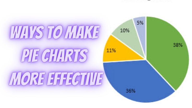
If you’ve been doing data presentations and data visualization, you probably have steered away from using pie charts. For some, this type of graph isn’t that great when it comes to communicating data. Plus, they can be hard to read.
However, even though pie charts tend to be problematic, you can do things to make them a lot more effective. Apart from using a reliable graph maker, you can use the following tips to make better pie charts.
Limit the number of slices in your pie chart.
Ideally, you shouldn’t be using more than five sections for your pie chart. If you do, you’ll end up with a really cluttered and overwhelming chart.
Labels become hard to read, and you’ll have a hard time picking enough colors for all the slices. Plus, It’ll be hard to differentiate between the sections, particularly the smaller areas.
If you really need to make a chart with several categories, it’s probably better to just pick another chart type. Alternatively, you can lump the small slices into a single color like neutral gray.
Put the biggest slice at the top.
Start working on your pie chart like a clock. The biggest slice should be placed at the 12 o’clock position. From there, you can work your way around the chart. Not only will it have a more pleasing look, but it will also be more organized and easy to read.
Be clear with colors.
Like with most chart types, colors are valuable in differentiating sections. However, when you’re working with a pie chart, you need to be extra picky with the colors you’ll use.
As much as possible, avoid using shades that look similar. It makes reading and identifying sections extremely difficult.
Instead, use contrasting colors. Apart from making interpretation easier, it makes pie charts look neater, too.
Now, how do you pick the best colors? First, they need to look nice. They have to make your chart look presentable.
Make sure that adjacent colors aren’t similar. For example, you shouldn’t put blue next to green. Putting these two colors next to each other will make the slices look confusing.
If your background is white, it should be out of your options. You want your slices to be clear and visible even from a distance.
You may like to know : Why People Opt for Custom Banner
Avoid using unnecessary effects.
There’s really no need to add 3D effects to pie charts. Any stretching or squashing effect will just distort the circle. It’ll add unnecessary depth that’ll make comparison hard.
If you want your pie chart to be accurate, stick with a basic design. Additionally, you should also avoid adding shadows to your chart. It’ll just clutter up your graph and make the data harder to understand.
There are many online graph makers out there that you can use. Venngage, for instance, provides premade templates that you can use to create simple to complex pie charts.
Don’t neglect the center of your pie chart.
A lot of people don’t bother locating the center of their pie charts. As a result, sections become uneven and angles look awkward.
If you want your chart to look neat and accurate, look at the center of your chart. Use it as a reference point to check sections and angles.
Check your data.
Pie charts should be used when you’re doing a parts-to-whole comparison. If your data don’t fit this category, like when you’re plotting proportions and percentages, then a pie chart won’t work for you.
Apart from that, it would be best if you also considered the sum of your proportions. It should be equal to 100%.
Don’t compare multiple pie charts.
Understanding one pie chart is already hard. If you line up a couple of them for comparison, it gets even harder.
If you really need to compare multiple sets of data, then use a stacked bar chart instead.
Forget about legends.
Going back and forth between your legends and the actual pie chart can be tiring for the eyes.
To avoid this, try to label the categories directly. Put the names on the slices so your audience won’t have to search for what a certain slice means when interpreting data.
Add a descriptive title.
When creating a title for your pie chart, it’s a good idea to describe your source data. You can cite where it came from by adding the company or location the data were sourced.
Remove gridlines.
Gridlines that don’t add any meaningful information to your chart should be removed. They can just distract your audience and make your chart look too cluttered.
If you don’t know how to remove gridlines, try selecting one of them. After that, you can just press delete.
Try to be consistent.
If you are working on multiple charts in a single worksheet, make sure that they are all consistent in the way they look.
To make this process a whole lot easier, you can format your chart according to what your presentation and data mean. Then, save it as a template. Once saved, you can use it to make your other charts.


